PlainSight started as a school project to design an iOS app prototype for a smart refrigerator. The brief specified the core features: setup flow, food tracker, temperature controls, ice maker toggles, and an inventory system. What it didn't specify was how to make it feel good to use.
I submitted the original and wasn't proud of it. The layout felt cluttered, the hierarchy was unclear, and the visual direction was immature. After months of reflecting on what kind of designer I wanted to be, I came back to it. Not because I had to, but because I knew I could do better.
I submitted the original and wasn't proud of it. The layout felt cluttered, the hierarchy was unclear, and the visual direction was immature. After months of reflecting on what kind of designer I wanted to be, I came back to it. Not because I had to, but because I knew I could do better.
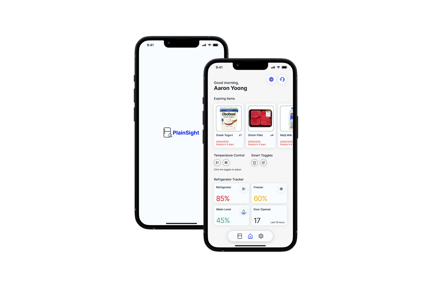
Problem statement
People don't forget to buy food, they forget what's already in their fridge. Items get pushed to the back, expiry dates go unnoticed, and food gets thrown out - wasting money without anyone realising until it's too late.
PlainSight treats the fridge like a library. Every item is logged, tracked, and surfaced before it expires. The app puts fridge control in your hand the way a remote controls a TV - temperature, toggles, and inventory visible at a glance, without opening the fridge door.
PlainSight treats the fridge like a library. Every item is logged, tracked, and surfaced before it expires. The app puts fridge control in your hand the way a remote controls a TV - temperature, toggles, and inventory visible at a glance, without opening the fridge door.
Before vs after (Version 1 vs 2)
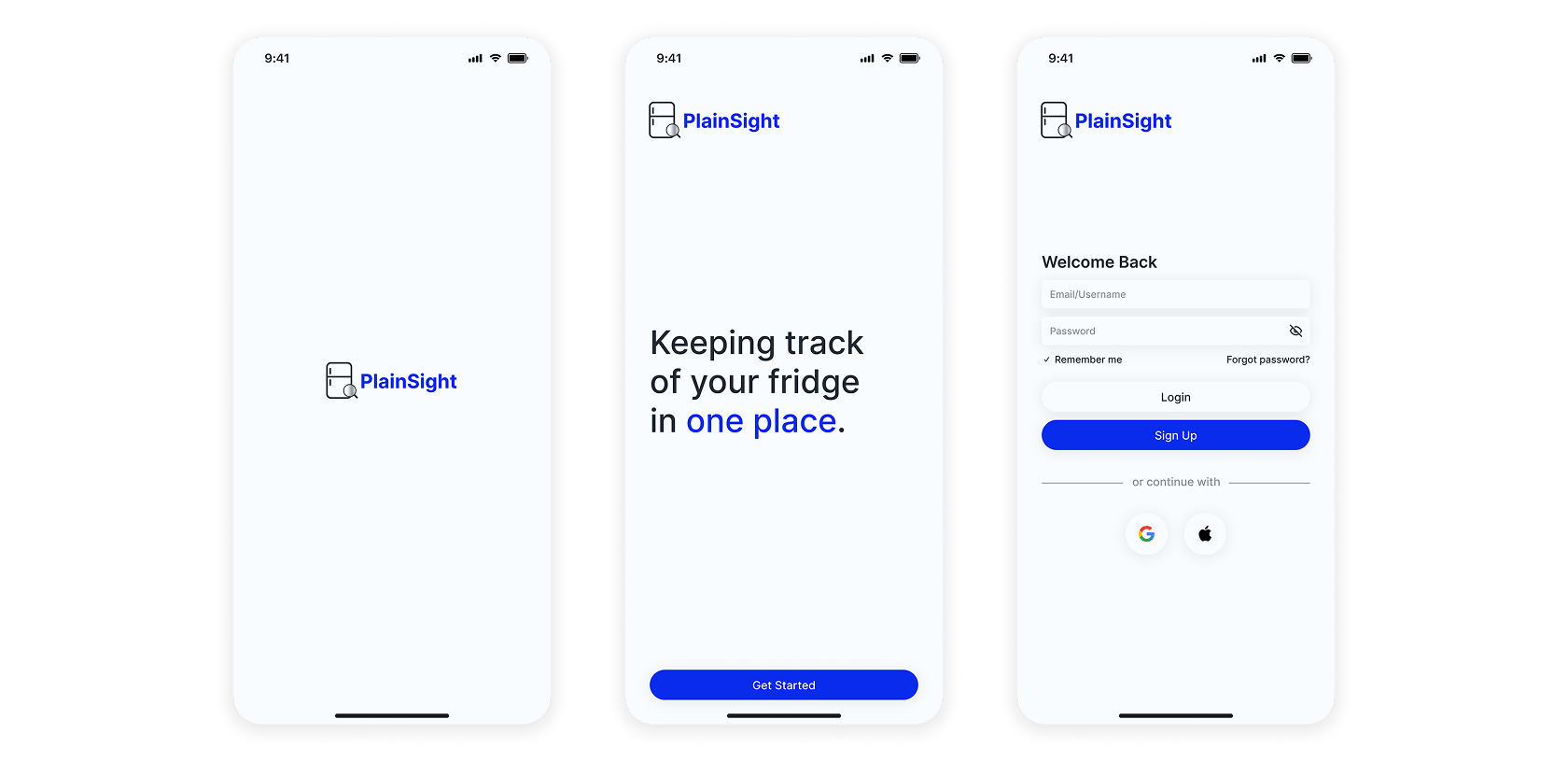
Login/Setup Screen
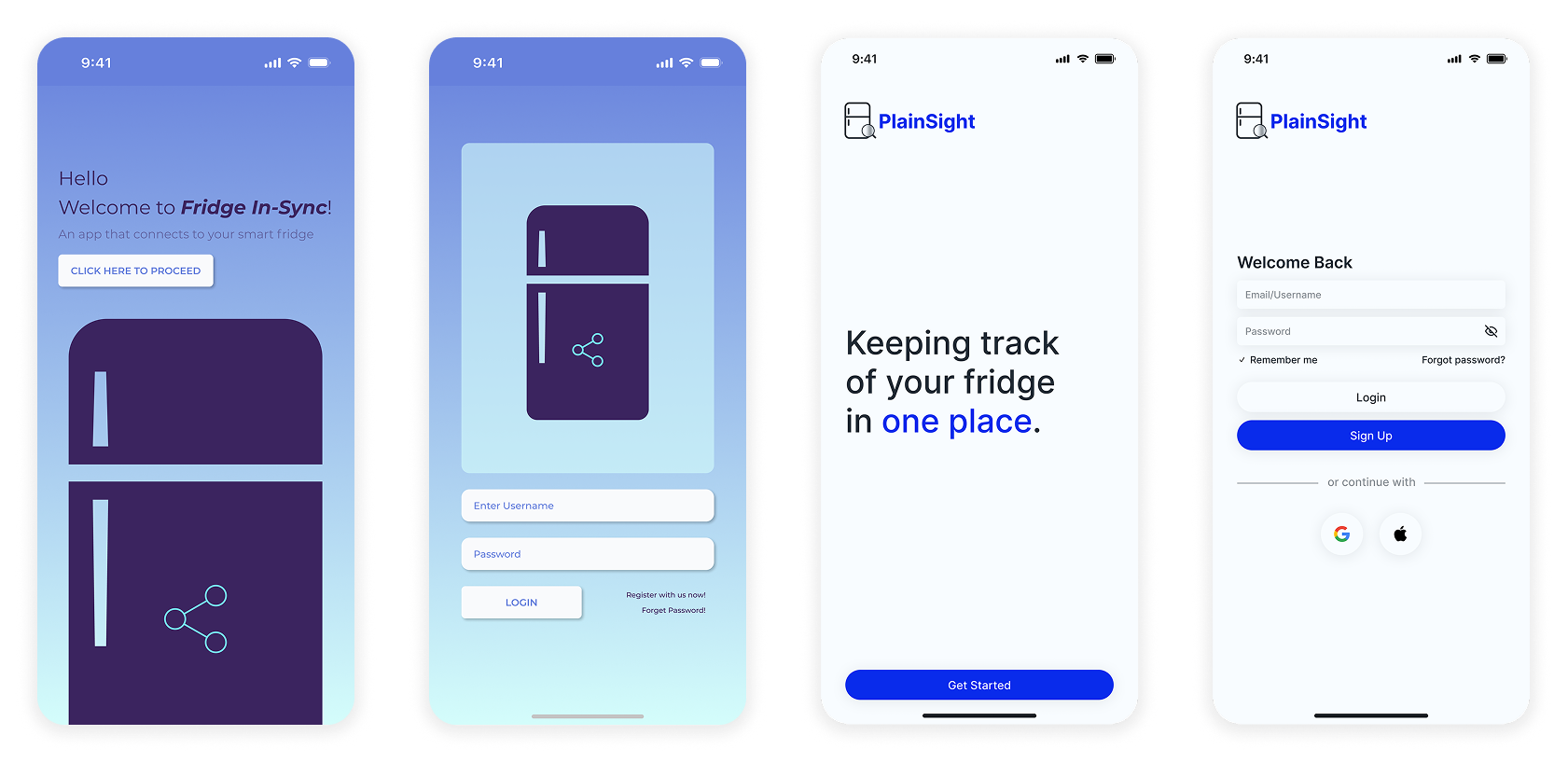
Version 1 had the heavy gradient backgrounds, stock fridge photo, light coloured text and box, and misplacement of “Register with us now! & Forgot Password.”
Version 2 strips the gradients entirely, using a clean white background with a clear tagline and a single accent colour for the CTA.
Version 2 strips the gradients entirely, using a clean white background with a clear tagline and a single accent colour for the CTA.
Home Screen
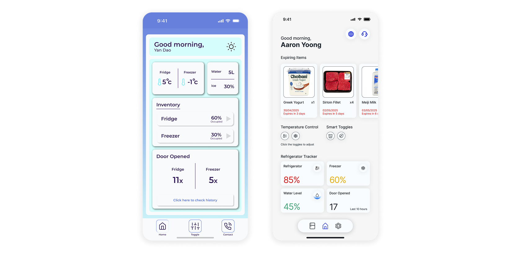
Version 1 had equal weight and size on everything with annotation arrows, confusing the eye and sense of navigation.
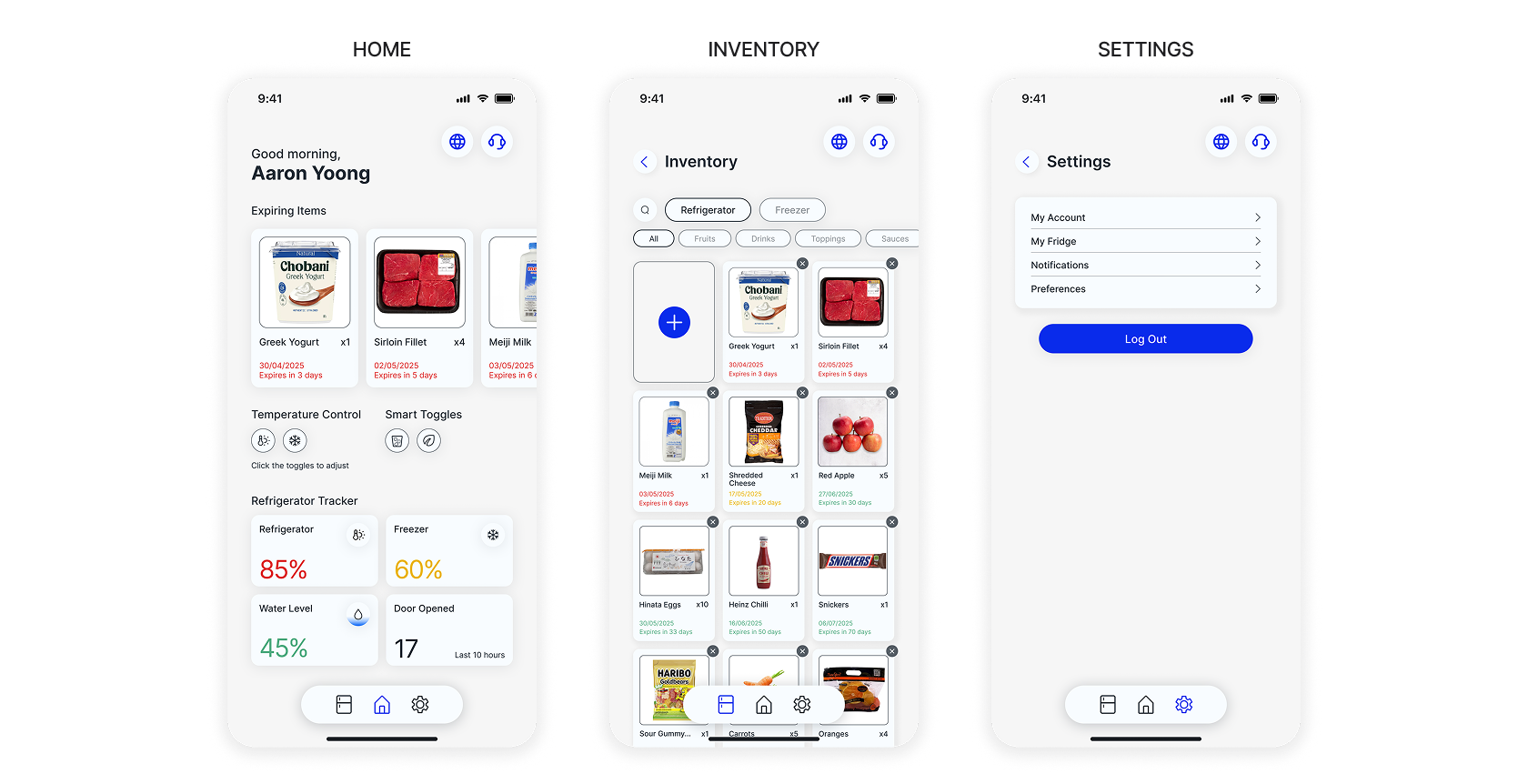
While Version 2 leads with the expiring items, toggle and control buttons in one move, and colour-coded percentages. The difference is immediately obvious. The bottom navigation bar uses colour to indicate the active page, something V1 didn't address.
While Version 2 leads with the expiring items, toggle and control buttons in one move, and colour-coded percentages. The difference is immediately obvious. The bottom navigation bar uses colour to indicate the active page, something V1 didn't address.
Food Tracker/Inventory
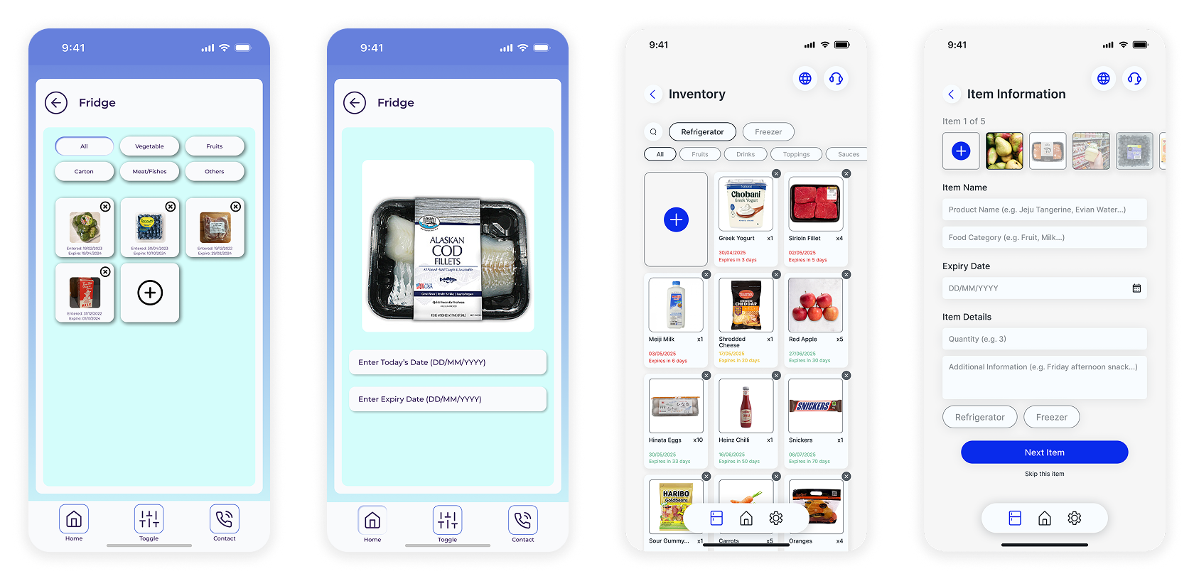
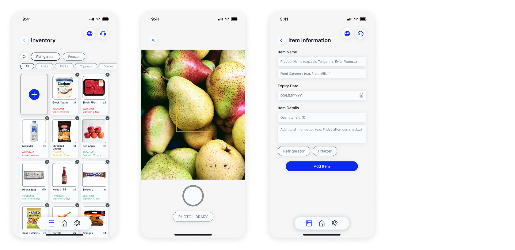
Version 1 had disproportionate visual hierarchy and use of weights with very small text information, the items image, and the selection of category filters. On the add items screen, there were missing information like name, food category, items quantity, and where the items should belong to.
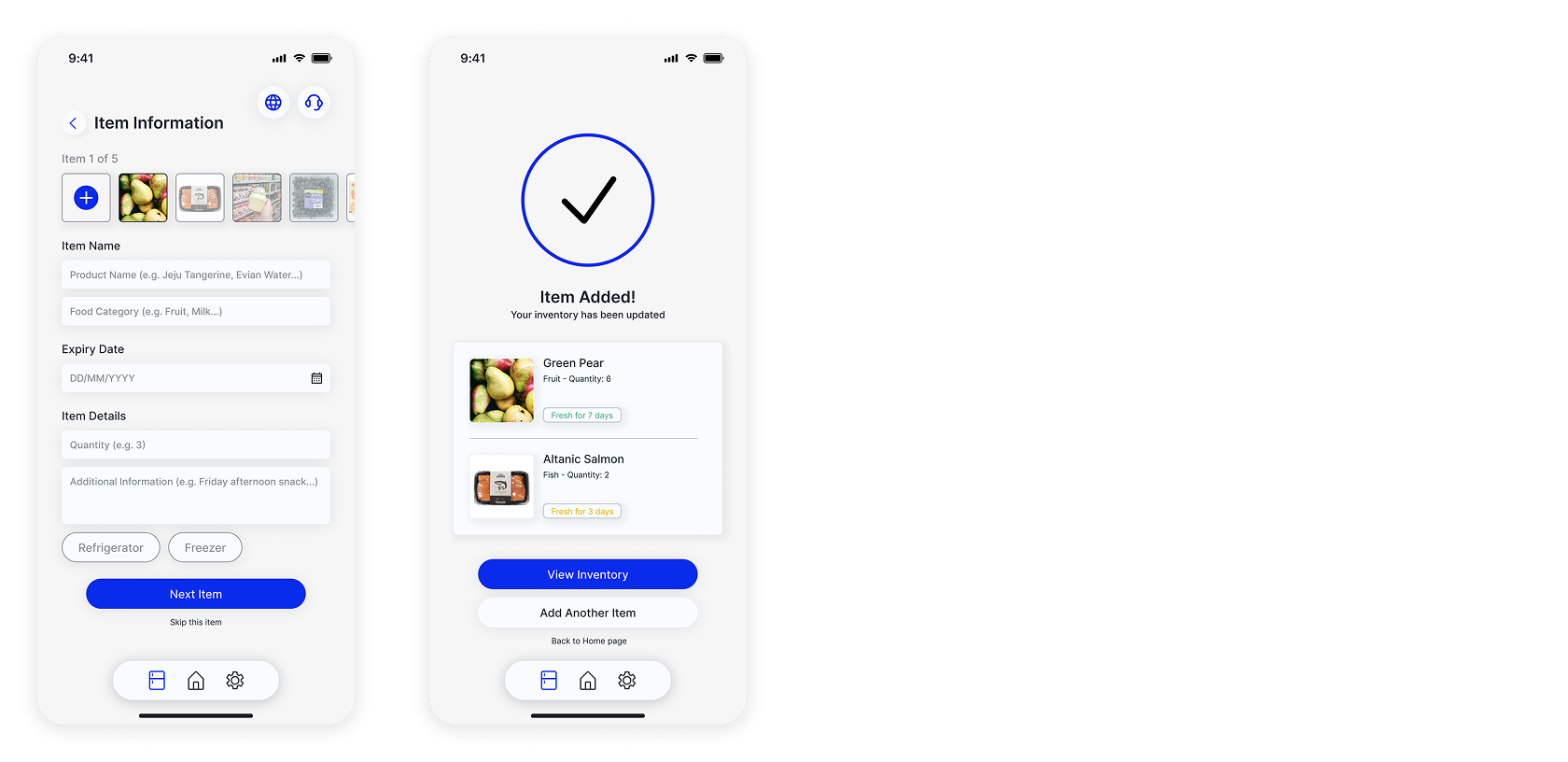
Version 2 changes that by using the same design decisions of prioritising the expiring items, add item box in the first row, category filters of refrigerator and freezer and food category selections, and ending with the queued multi-item flow.
Version 2 changes that by using the same design decisions of prioritising the expiring items, add item box in the first row, category filters of refrigerator and freezer and food category selections, and ending with the queued multi-item flow.
Design walkthrough
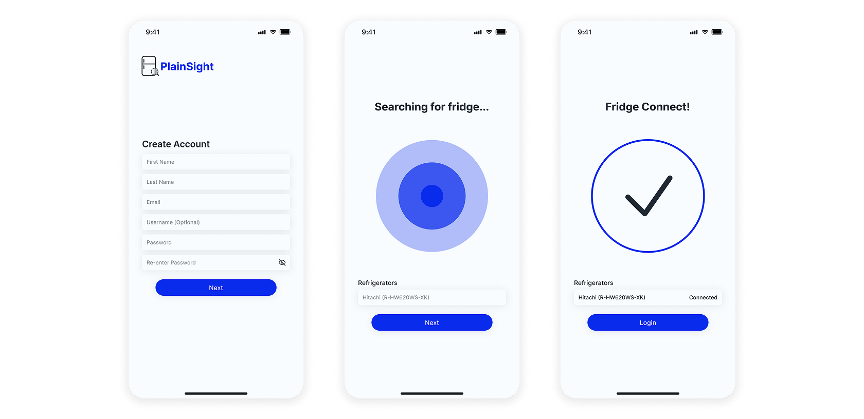
SetUp/Login Section
Main Screens Section
The brief required a food tracker. My decision was how to make food status instantly readable without thinking. I landed on a colour-coded freshness system, green, amber, red, because it borrows from a signal language people already understand. The goal was to let someone scan their entire inventory in seconds.
For the add items flow, I designed a queued strip at the top so users could work through multiple items in one go. Unpacking groceries is never a one-item task, and making users exit and re-enter for each one creates unnecessary friction.
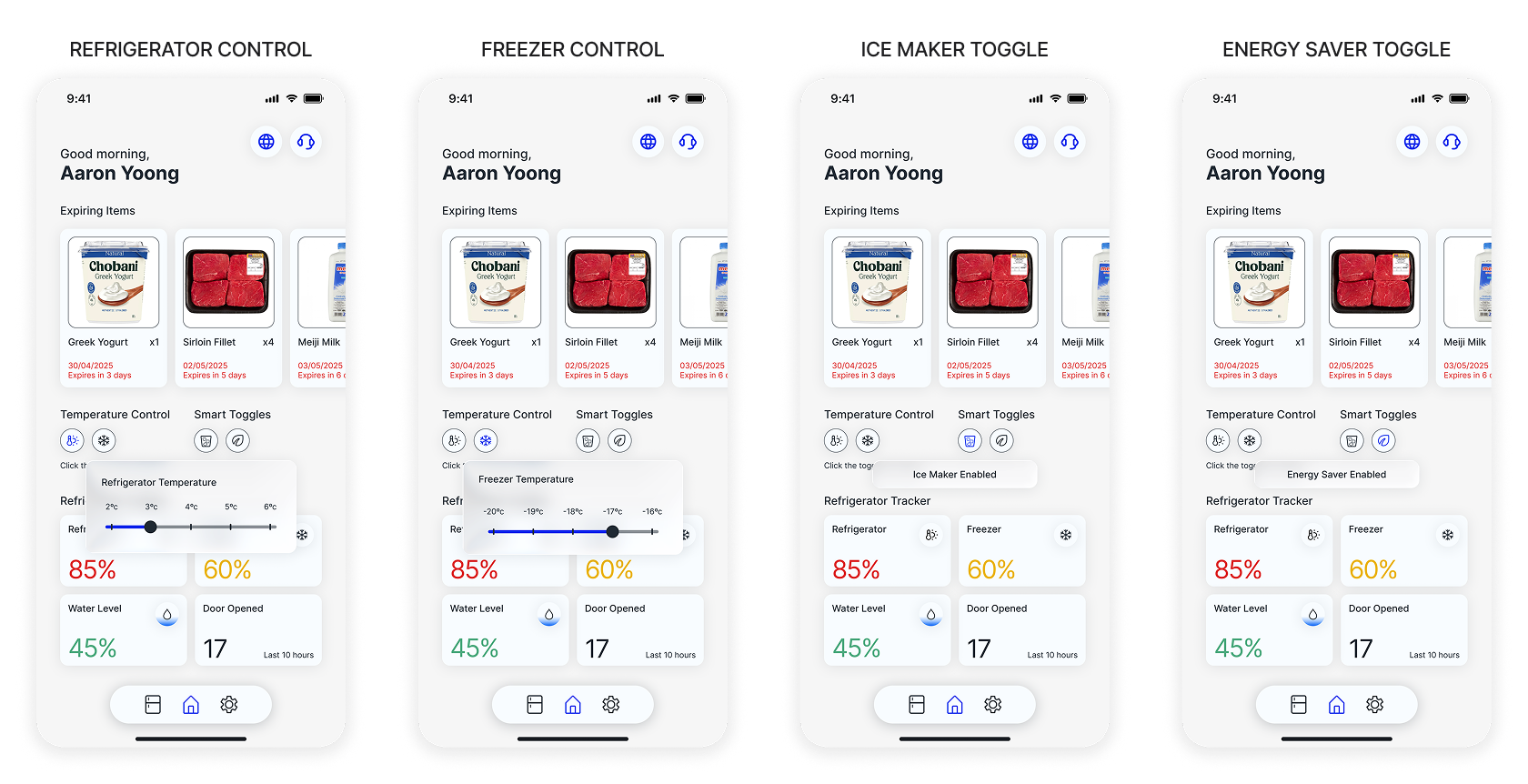
For the home screen, which the brief left open, I surfaced expiring items, temperature status, and key toggles at a glance. The information a user would actually want to check daily.
For the add items flow, I designed a queued strip at the top so users could work through multiple items in one go. Unpacking groceries is never a one-item task, and making users exit and re-enter for each one creates unnecessary friction.
For the home screen, which the brief left open, I surfaced expiring items, temperature status, and key toggles at a glance. The information a user would actually want to check daily.
Controls and Toggles Section
Adding Items Section
Looking back, I designed entirely from my own assumptions and frustrations. I never tested any of it with real users. If I were to rebuild this, I'd talk to people about how they actually use their fridge before opening Figma. The design might end up exactly the same, or completely different. I wouldn't know until I asked.